Loyalty app for Shopify
2026
From zero to a published app in 72 days
I was the only designer on a team of three. In 72 days I designed the app, the brand and everything needed to launch on the Shopify App Store, on a platform none of us knew.

Overview
The founders had the idea of building a loyalty app for Shopify stores. When I joined, nothing had been built yet, only the idea. We had no prior experience either, since none of the three of us had designed or developed a Shopify app before.
My job was to give it all shape: I designed the complete product, from the app the merchant uses to what their customers see in the store, as well as the brand and the launch.
Impact
An app published in 72 days
Points program, automations, analytics and storefront components, approved on the Shopify App Store.
Product, brand and launch, all from one designer
I designed the app, the identity, the landing page, social media content, the listing images, the support content and the materials to go out and find users.
A second version shaped by the first merchants
What our first users told us changed the onboarding, the support and how much control they had over their program.
Starting point
Learning the platform while designing for it
The idea came from the founders and was already decided. What was missing was everything else.

I started by understanding how a Shopify app is built. They're designed with Polaris, Shopify's design system, and go through a review before being published. That gave me a clear framework. I didn't have to invent components, I had to decide how to use them well.
Scope
Everything a merchant sees, end to end

Producto
La app completa, con ocho secciones, y los componentes que el cliente ve en la tienda.
Emails
Los que el merchant le envía a sus clientes y los que nosotros le enviamos al merchant.

Marca
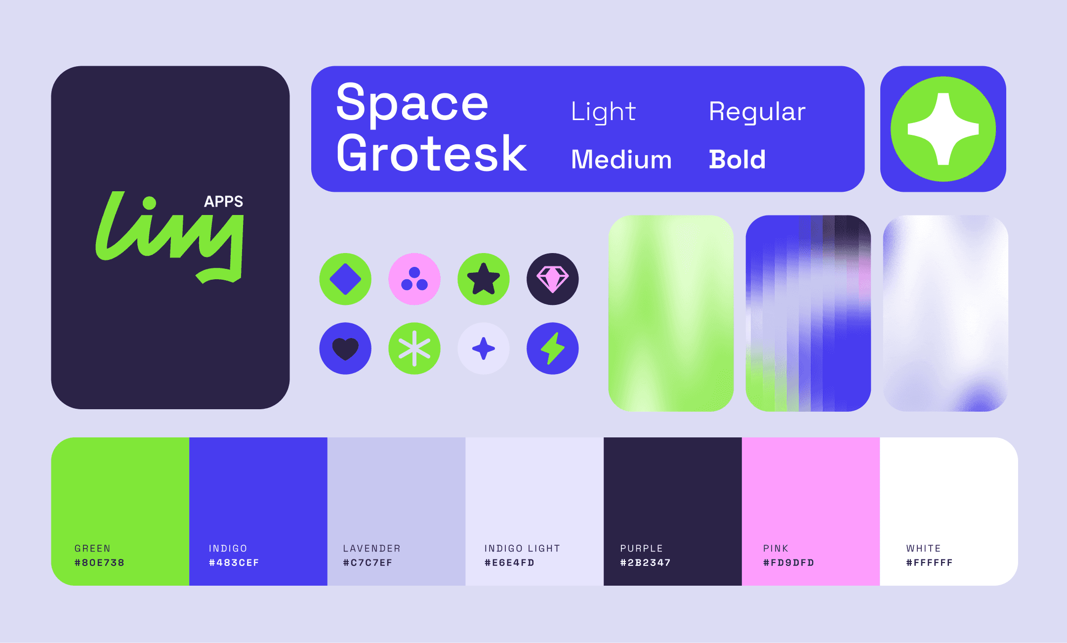
Nombre, logo, paleta, tipografía, texturas, íconos. Identidad visual. Icono de app.
Lanzamiento
Landing, listing del App Store, redes, deck para inversores y one-pager.

Soporte
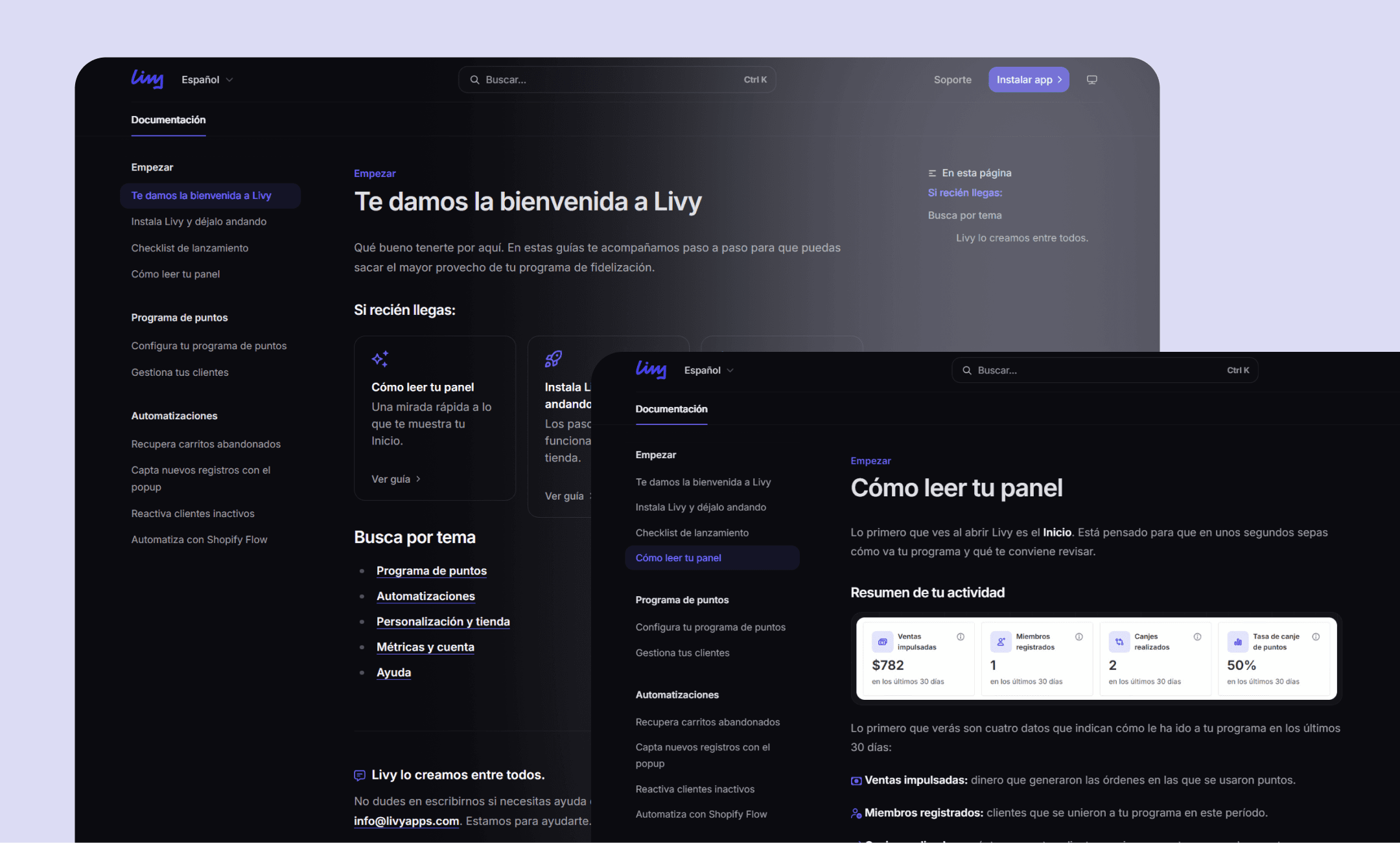
Guías de ayuda y un chat de consultas.
Brand
Warm and light, starting with the name
Loyalty apps tend to look technical and cold. We wanted the opposite, a warm and light brand, and that's where the name came from.
I drew the logo by hand, starting from a handwritten typeface. That stroke is what makes it feel more human. I paired it with an indigo and green palette and a set of simple icons that repeats across the app, the landing page and social media.

The app
Three decisions that run through the whole app
A points program involves a lot of setup. Onboarding solves the first part with three ready-made strategies, and I cover it in detail in its own case study.
Here are the decisions that hold up the rest:
01
A first result before the first redemption
A points program takes time to show its value, because customers need several purchases before they can redeem. The risk was that merchants would uninstall before that.
Since we can see their customers and their last purchase as soon as they install, I designed a banner on the home screen that shows how many haven't bought in a while and how much the merchant could recover, and takes them to turn on the win-back automation.

02
Show the real preview, don't describe it
Every feature or automation setting has a diagram next to it showing how it works. The points program is only one of the reasons a store writes to its customers, and merchants worry about becoming spam. They want to know which email is sent, how many, and when. The diagram answers those questions before they turn anything on.
They also care that what they install fits the style of their store, which is why every email and every component has its own preview.

03
The same language for every state
A module can be not set up, active or paused. Across the whole app the state is shown the same way, always next to the action the merchant can take at that moment.

Working with developers
Making what's built match what's designed
Since Shopify apps are built on Polaris, I skipped wireframes. I prototyped directly with real components and reviewed each screen with the developers before polishing it.

I handed off each screen with a spec sheet for developers: numbered notes on the screen, what was new, what was changing and what was left for a future version.
After launch
What changed after listening to the first merchants
Migrating without fear
We added customer import to onboarding, for merchants coming from another app with points already awarded.
More control
Some values were fixed. After talking with a user we made them editable, and kept suggestions for those who'd rather not think about it.
Asking before installing
Many merchants have questions before installing an app and no one to ask. We added a chat on the website and in the app.
Catching up
We added around ten ways to earn points and several ways to redeem, because having only a few put us at a disadvantage against other apps.
After this version, the team needed a second app to attract users. I tell the story of that week in the referrals app case study.
Lessons
The result
The app was published in August 2026. Three merchants installed it while I was on the team, and all three completed onboarding. It's a small sample, and I left the team before we had more data.
Lessons
01
Designing inside a platform means learning its habits
Learning Polaris took us time, but that time paid off later. Building inside a platform also let us learn the mental models and patterns already used in it, which meant users would already be familiar with them.
02
Value has to arrive before patience runs out
An app can be good and still get uninstalled if its first result takes too long to arrive. Today I think about that first moment from the very beginning and design with it in mind.
03
Today I start by researching the idea
With this app we went straight to building, because the priority was to launch fast. What I learned from publishing it changed how I start. On the second app, the first thing I did was research whether the idea answered a real need.


