Loyalty app for Shopify
2026
Turning a points program setup into a single decision
Diseñé desde cero el onboarding de una app de fidelización para Shopify. El reto era que una herramienta con mucha configuración se sintiera simple desde el primer minuto, tanto para quien arma su primer programa de puntos como para quien trae uno que ya funciona.

Overview
A points program looks simple from the outside. But to launch one, a merchant has to decide how many points each purchase earns, which rewards to offer and what they cost, which emails customers receive and how it all looks in their store. Every choice affects their margin.
My goal was to help merchants launch their program in a few minutes, without understanding all the logic first and without feeling they were losing control. As their first contact with the app, onboarding also had to give them a glimpse of what they'd find inside and make them feel supported along the way.
Impact
One decision instead of five En el original falta la tilde: "Una decisión en lugar de cinco".
A ready-made strategy as a starting point, instead of five separate values.
Peace of mind when migrating
Confidence for merchants coming from another app, who get to keep their customers and points balance.
Support after onboarding ends
Easy access to every setting left pending during onboarding.
Starting point
Setting up a points program is abstract and risky
A generous program attracts customers, but if rewards are too high, merchants lose margin every time someone redeems. And the relationship between points and money isn't easy to picture.
Not everyone arrives in the same place, either. Some merchants are building their first program and need someone to suggest a strategy. Others come from another app with customers and points, and their biggest fear is losing their customers' points or having to enter everything by hand.
Research
What makes an onboarding work
I reviewed the onboarding of 10 to 15 Shopify loyalty apps, plus a few successful apps in other categories. The best ones made setup feel simple and guided the merchant from start to finish.
Essentials first
Showing everything upfront is overwhelming. What isn't needed to launch can wait.
Numbers with context
A number alone doesn't help anyone decide. Merchants need to see what it's worth in money and what their customers will see in the store.
Two profiles, two needs
Merchants starting from zero need guidance. Merchants migrating a program need reassurance.
Process
One rule for what goes in
Since Shopify apps are built on Polaris, I had every component ready in Figma. Prototyping in high fidelity took me almost the same time as a wireframe, and it showed from the start what could actually be built. So I went straight from flows to screens with real components, which I reviewed with the developers before polishing. Each iteration took two to three days.

Flow of the first version. A single path for everyone, and anything not needed to launch stayed in the dashboard.
To decide what went in, I used one rule:
Everything needed for the program to be live when the merchant finishes, and nothing else.
After launching the first version, that rule caught a gap. Email customization, which the program needs in order to work, had been left as a task for after onboarding.
Looking closer, we saw we were already asking for almost everything the emails required, except the logo. With one extra field, emails went live from launch.
First version
Reducing onboarding to the essentials
I applied progressive disclosure. Points expiration, extra ways to earn and automations were left out of onboarding, to be set up later from the app's dashboard.
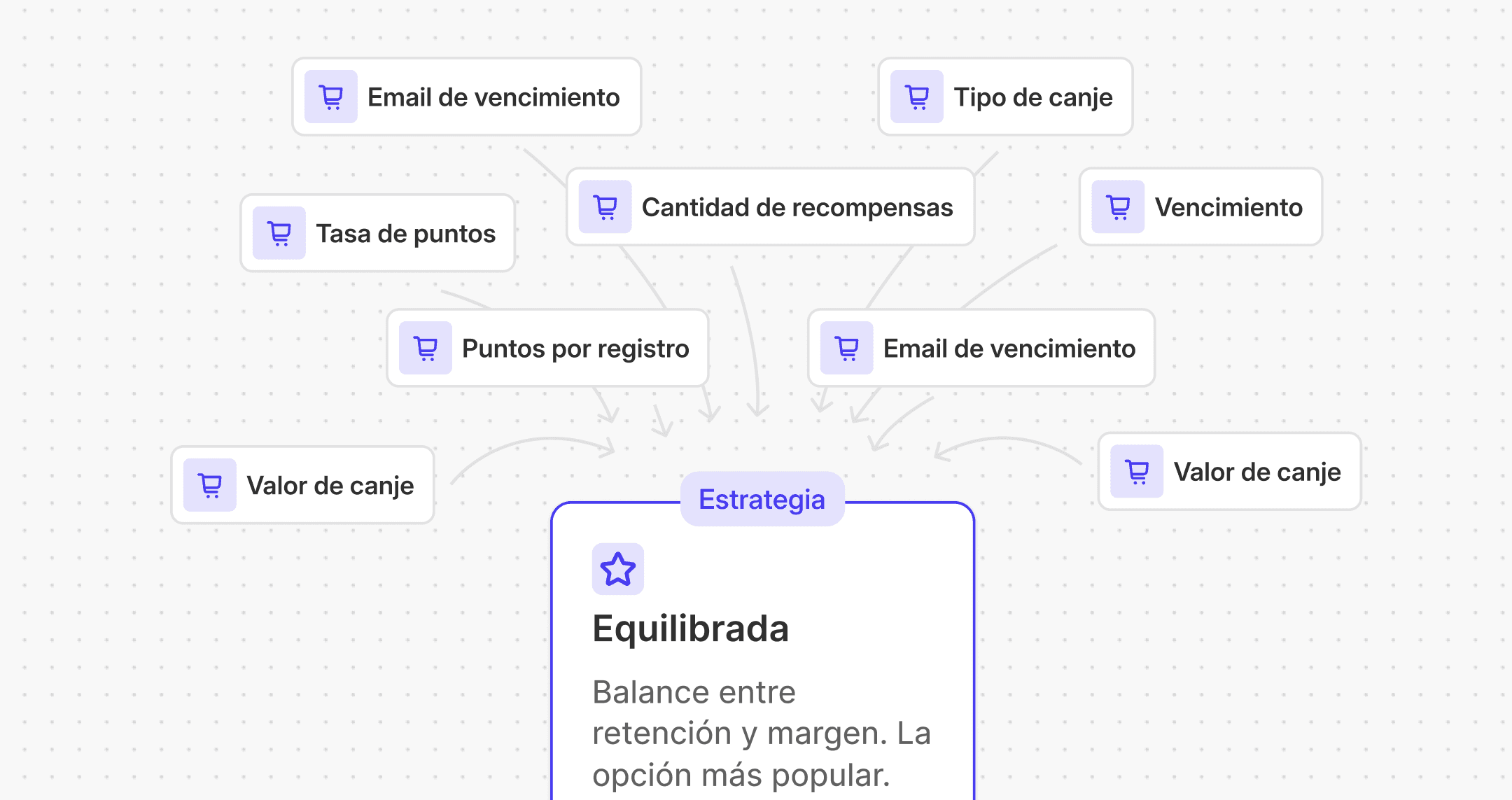
For the strategy, I designed three presets (Conservative, Balanced and Generous), each for a different margin, with a live preview of what each reward is worth. The values were locked on purpose, so a first-time merchant could pick one option and let the app calculate the rest.

First feedback
Our first user already ran a points program and wanted to switch apps. On a video call with the whole team, she set up the app while thinking out loud.
We had assumed an experienced merchant would need less help. She actually needed a different kind of help: freedom in some areas and reassurance in others.
Locked presets
She couldn't replicate the strategy that was already working for her.
Invisible import
Onboarding never told her she could bring her customers and their points, the first thing anyone switching apps wants to know.
Unclear format
The import failed because of a column name, and we didn't explain what the file should look like.
Final Design
One flow, two paths

Final flow. From the welcome screen, each merchant follows the path they need, and both meet again at customization.
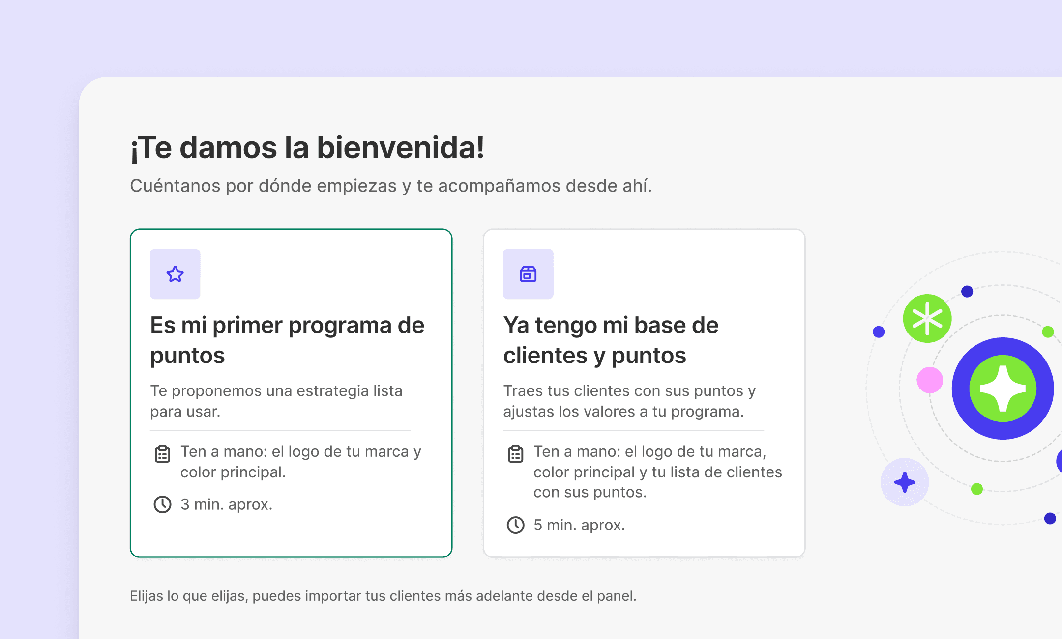
A fork from the welcome screen. Starting from zero or bringing an existing customer base, each path with its own estimated time.
One choice sets up the whole program, and every value can be edited. The settings panel starts collapsed for merchants starting out and expanded for those migrating.


Import inside the flow, with a template, a format example and clear errors.
Customization with a live preview that shows how customers will see the program in the store.

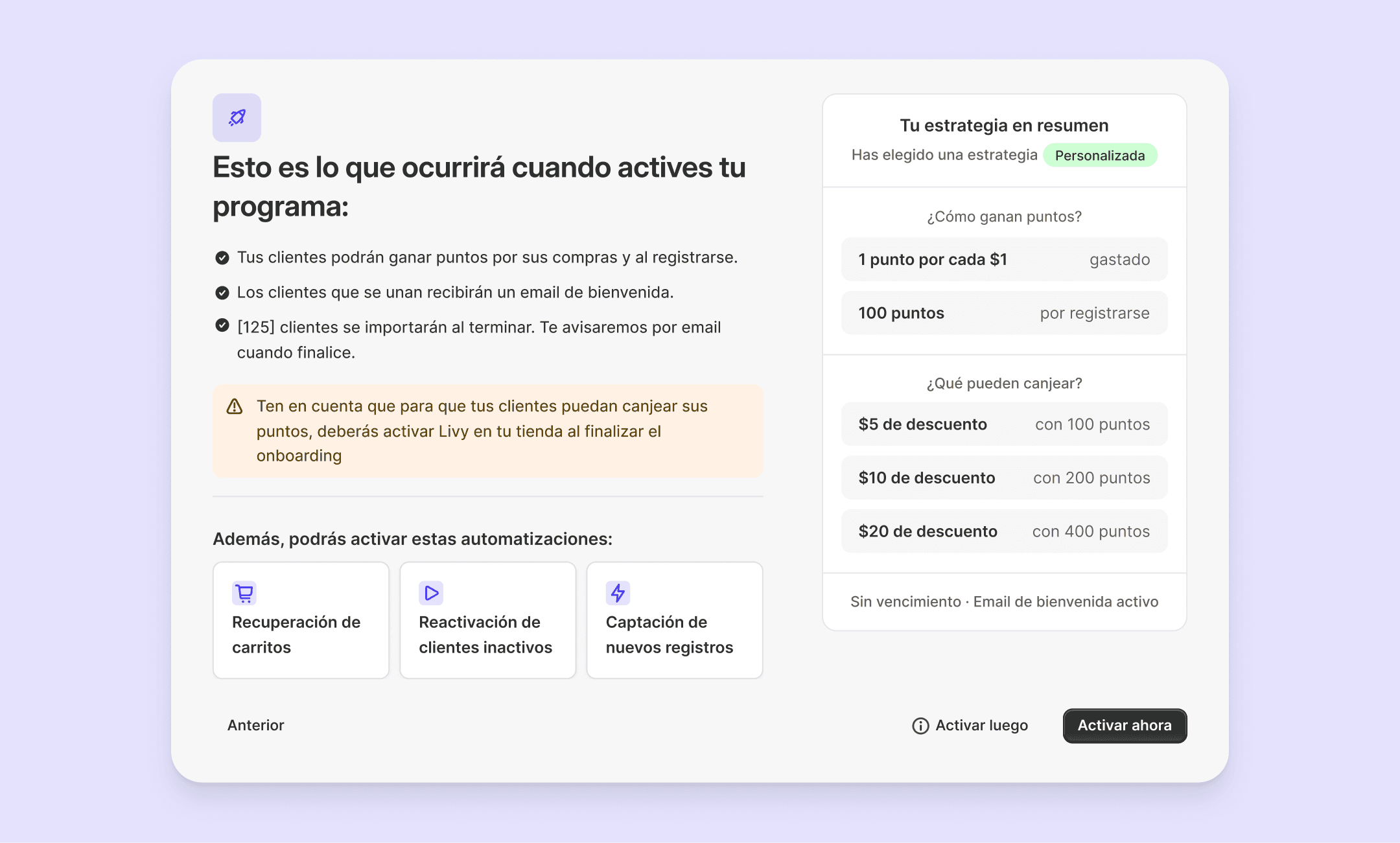
Review step, a summary of everything configured, what goes live and what to explore next.
After launch, everything is loaded into the dashboard. Banners and the setup guide adapt to what each merchant left for later.

Our second user, the owner of an agency that tests apps before recommending them to clients, set up this version and sent us written feedback.
"The strategy options feel especially smart. They turn something that could be quite abstract, like setting up the economics of a points program, into something a merchant can understand immediately."

App user
Owner of an agency for Shopify stores
Designing for what can go wrong
Nothing can be left empty
If a name, a color or a points value is cleared, it falls back to its default or to the selected preset. The program never looks broken.
Disabled states that explain themselves
The expiring-points email appears disabled, so merchants know it exists, with a note explaining why and where to turn it on.
Preventing and explaining errors
The import step shows upfront what the file should look like. And if something fails, the message says what went wrong and how to fix it.
Lessons
01
Simple doesn't mean the same thing for everyone
At first I thought simplifying meant removing options. Our first user showed me that, for an experienced merchant, taking away the ability to edit didn't make anything simpler. The balance was suggested values anyone can accept, plus full control for those who need it.
02
One user changed more than the benchmark
Reviewing competitor apps gave me a solid foundation, but it didn't show me where our own flow was failing. Watching a real merchant set up the app revealed, in a single call, three problems we hadn't anticipated.
03
What the user doesn't see is design too
Much of the work went into what happens when something goes wrong or is left pending: an empty field, a file with errors, a task for later. If that isn't solved, a simple flow breaks at the first bump.
With more time, I'd measure how much customization merchants actually need, so I could decide with data what belongs in onboarding and what belongs in the dashboard.


