Referral app for Shopify
2026
From an idea to a designed app in one week
I had one week to design a simple app that would attract our first users. I researched the initial idea, proposed a change of direction and delivered the complete design of a referral app, ready for development.

Overview
Our first app, a loyalty program, was complete but we were struggling to distribute it. We needed a second app, simple, quick to build and free, that would bring merchants closer to us.
I had one week to research the idea on the table and design it. I ended up designing a different one.
Impact
A decision made in time
We dropped an app that was more complex than it seemed before designing a single screen.
An alternative with a clear gap
An app that does one thing, in a category where they all do two.
A complete app ready to build
14 screens, 3 storefront components and 4 emails, with flows and developer notes.
Starting point
A simple app to attract our first users
The goal wasn't to add another big product. It was to have something a merchant could install and understand in minutes, and that would work as our way in.
Initial idea
The founders' idea was a pre-order and back-in-stock app. It seemed to tick every box we needed: useful, contained and quick to build.
We believed Shopify already handled those states (pre-order and back-in-stock alerts) but that its themes didn't show them yet. The app would only need to add that button on the product page and the collection page. That's why it looked simple.
Research
As simple as it looks?
I spent a full day on pre-order. I looked at the apps that already existed and read what merchants were saying in the Shopify community, to understand whether it was a real need and whether it was already solved some other way.
The need had cooled down
Questions about it had dropped. Many merchants were already solving it with an app or with changes to their store's code.
It wasn't a simple app
It required blocks in several parts of the store, changes to collections and products, and campaigns to create and schedule.
Simplifying it took it out of the game
Existing apps offered a lot of customization at a very low cost, or for free. A stripped-down version couldn't compete.
When I saw it might not be a good idea, I didn't dismiss it on my own. I looked into why, and asked the founders for a meeting to see if they knew something I didn't.
Change of direction
Bringing an alternative, not just a no
Before the meeting I researched an idea we already had floating around: a referral app.
I reviewed a few apps and found a pattern. They all combined referrals with something else, like loyalty or affiliates. None of them did referrals alone.
I also understood that, for a referral app, making it simple didn't mean stripping away customization or features and leaving it at a disadvantage against the competition, as it would with the pre-order and back-in-stock app.
New proposal: referrals
A focused app, with a single feature that helps achieve a single goal.
We also had a real signal. A store with high-ticket, infrequent purchases had told us a points program didn't work for them, but a referral program would.

On a video call I walked the founders through the whole analysis: the demand that had cooled down, the amount of setup pre-order required and why a stripped-down version couldn't compete, and the gap in referrals. With all of that on the table, the three of us decided to move forward with referrals.
Designs
An app that does one thing
With three days ahead, the scope had to be clear. The app lets merchants create a referral program, define the rewards, see who is referring and show it in the store. Nothing else.

Onboarding
Three screens that ask only for the essentials: what the referrer earns and what their friend earns. On activation, the app takes the merchant to the storefront screen to switch on the components, because without them the program is live but nobody sees it.
Index
Just enough to know how the program is doing: metrics, status and access to settings. A banner reminds the merchant to activate the components if that was left pending. And a link to our loyalty app, which was the underlying goal, appears only if the merchant doesn't have it.


Program settings
Everything comes ready and can be edited. Sharing options come with their own copy, referred friends land on the homepage by default, and active emails can be previewed exactly as customers receive them.
Storefront
A pop-up where the friend leaves their email and gets their code, plus two blocks for customers to share their link. The pop-up works even without an image, and handles five error cases, including referring yourself.

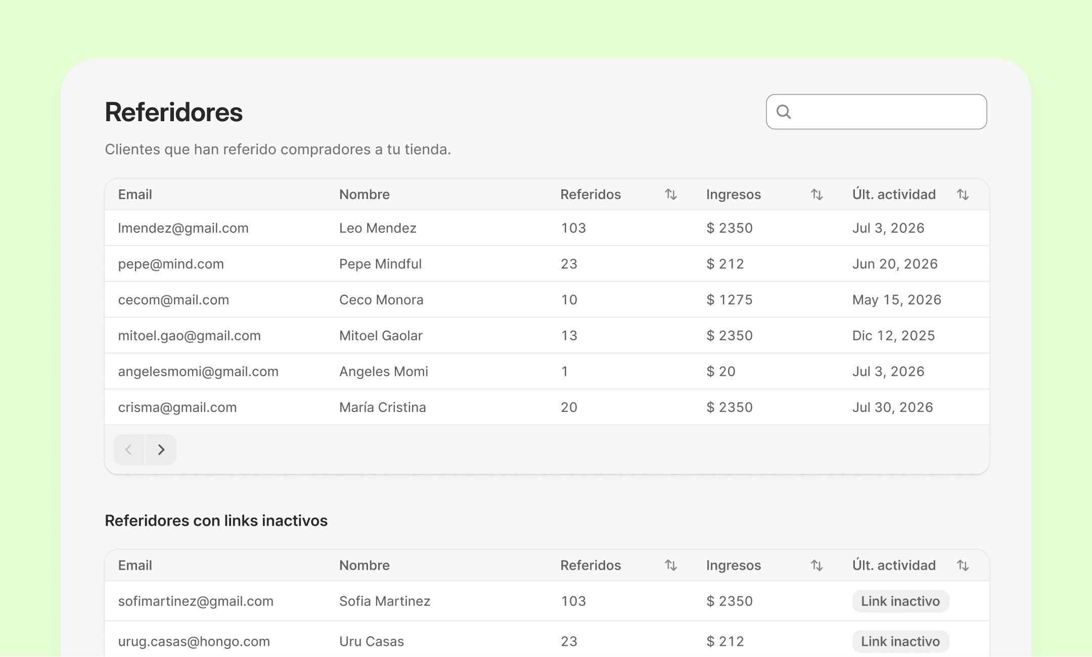
Referrers
The merchant sees who is referring, how much revenue each one brings in and whether they have pending rewards. If they spot fraud, they can block that link.
What made it possible was thinking of the two apps as a suite. I reused sections and screens from the loyalty app, with adjustments, instead of designing everything from scratch.
We also had to separate the brand from the products. Until then, the first app had used the brand's logo. With two apps, the logo stayed with the brand and I proposed an icon for each one, different but from the same family.
Delivery
I delivered the designs, the flows and the developer notes, along with the 4 images for the listing. The app was ready to build. It wasn't developed while I was on the team, so I don't have usage data.
Lessons
Un sistema te hace rápida
Diseñar la segunda app como parte de una suite me dejó reutilizar lo que ya funcionaba. La velocidad vino de las decisiones tomadas antes.
01
Un día de research ahorra una semana de diseño
Lo más útil de esa semana fue lo que no diseñé. Frenar el primer día para entender la idea evitó construir algo que no cumplía el objetivo.
02
Un "no" se escucha mejor con una alternativa
Es mi forma de trabajar. Cuando creo que lo que me piden no resuelve lo que necesitan, reúno las razones y llevo otra propuesta. Así no discutimos si yo tengo razón. Elegimos entre dos opciones con información, y la decisión sigue siendo de ellos.
01
Un sistema te hace rápida
Diseñar la segunda app como parte de una suite me dejó reutilizar lo que ya funcionaba. La velocidad vino de las decisiones tomadas antes.


